

April 28, 2026
/
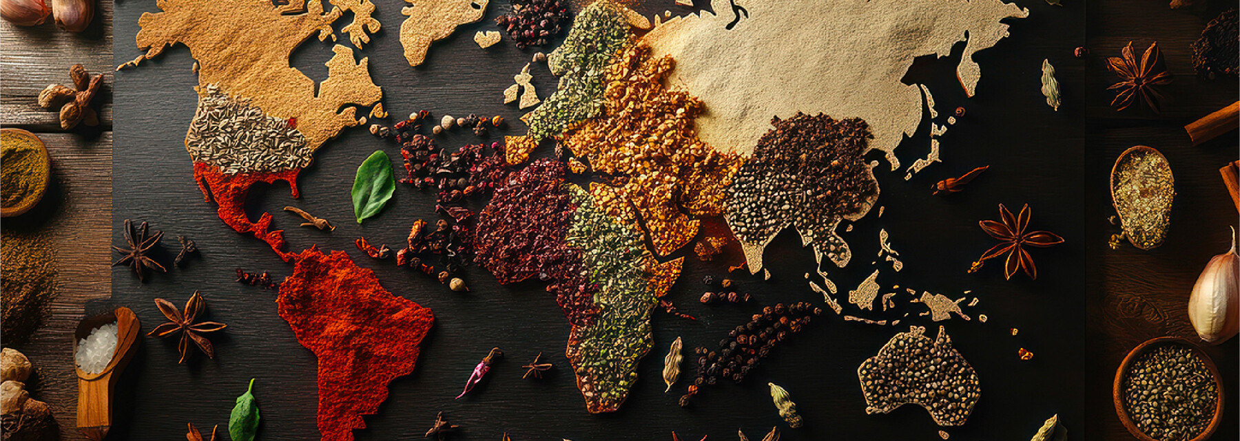
Why Product Color Belongs in the Flavor Conversation
How does color affect taste? Same formula. Same aroma. Same sweetener system. Now tint one sample red and the other blue.
There’s a decent chance people will tell you they don’t taste the same. One seems sweeter. One seems fruitier. One feels a little “off,” even though the chemistry never moved an inch.
That’s the trick color pulls in food and beverage: it shows up early and starts making promises.
Before aroma fully lands and before taste gets much say, the eyes have already handed the brain a working theory. Sweet or tart. Ripe or artificial. Familiar or suspicious. Color doesn’t just decorate flavor. It gives the brain a head start. And for R&D, that’s not some cute sensory fun fact. That’s product performance.

How Does Color Affect Taste? Your Eyes Get First Draft
Flavor doesn’t arrive as a neat little lab report. It arrives as a full sensory pile-on: appearance, aroma, taste, texture, expectation, memory, mood. Color is one of the loudest signals in that pile.
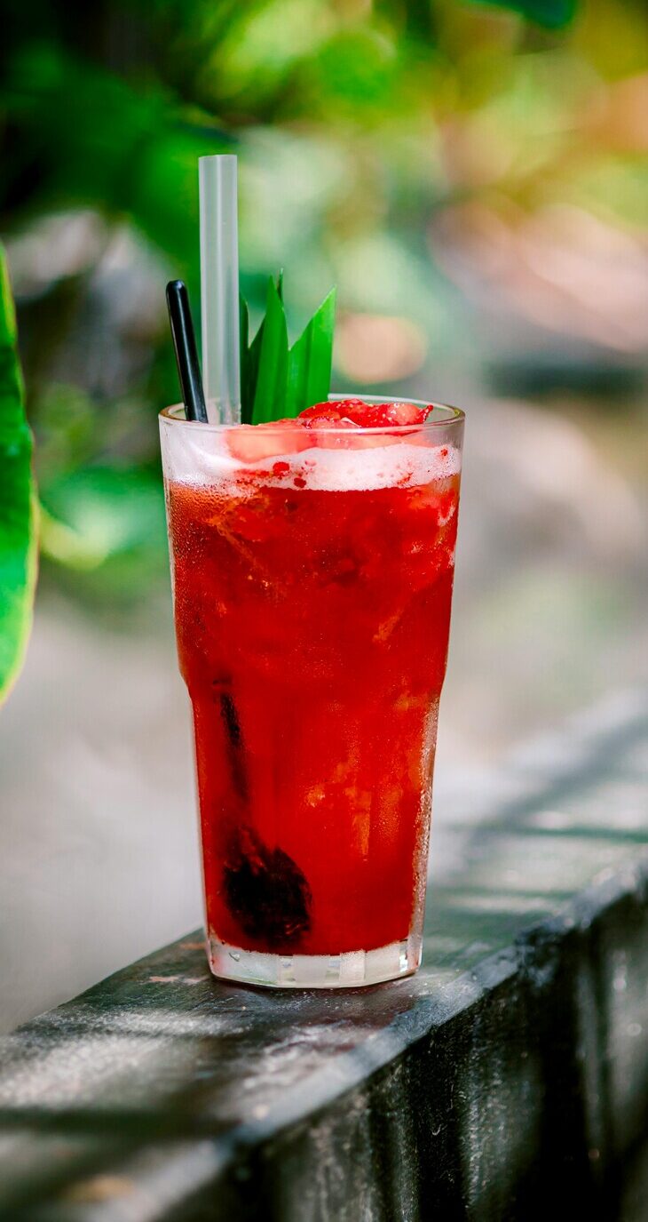
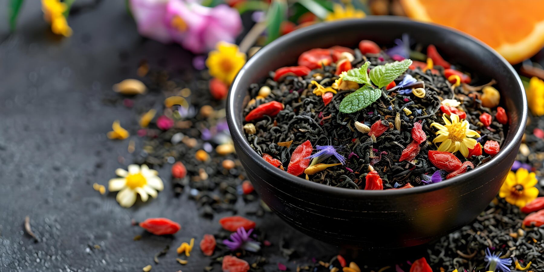
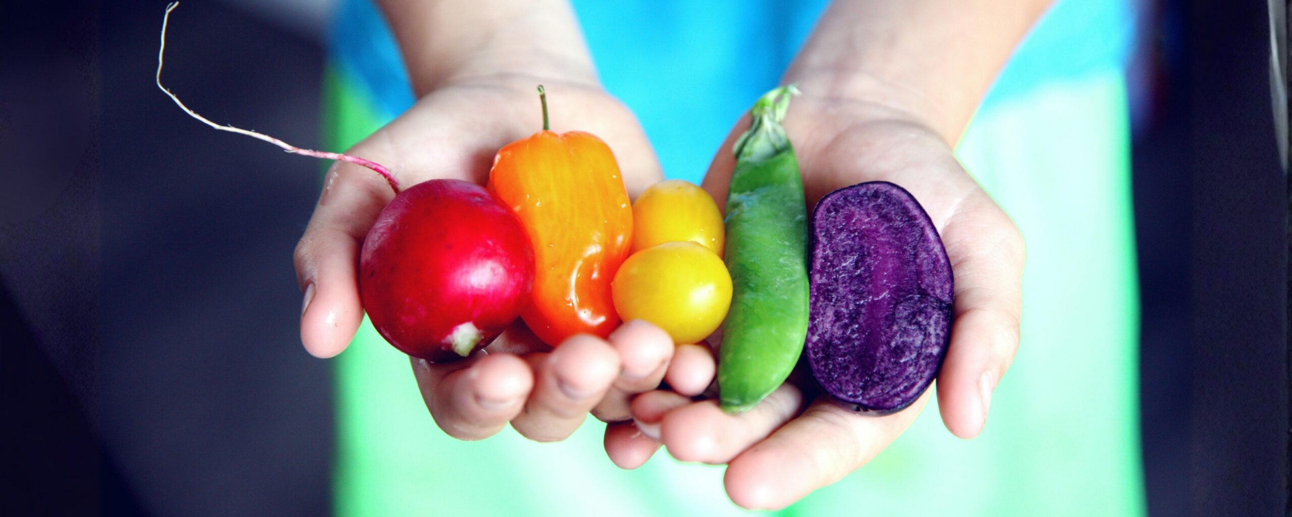
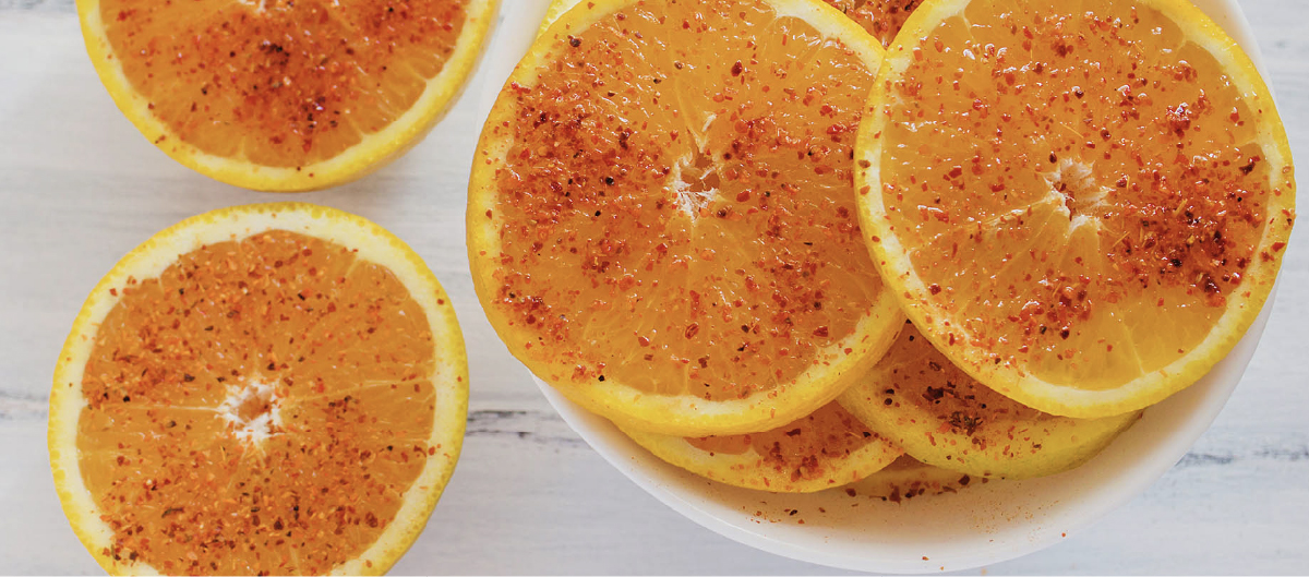
So yes, people learn color–flavor associations over time. Red and pink often read as sweet, ripe, or berry-adjacent. Yellow and orange usually point the brain toward citrus, brightness, or tang. Brown brings caramelized, cola, toasted, or dessert-shop expectations. Blue is the odd one. Sometimes it’s fun. Sometimes it’s a problem in a very shiny outfit.
That’s why color–flavor congruency matters. When the look and the taste agree, the product feels more believable. It makes sense faster. When they don’t agree, the consumer may not know why it feels wrong, but they’ll know that it does.
Translation: nobody says, “This sample suffers from expectation disconfirmation.” They say, “Huh. That tastes weird.”
Red gets the benefit of the doubt
If you’re building sweetness, fruitiness, or indulgence, some colors have an easier job than others.
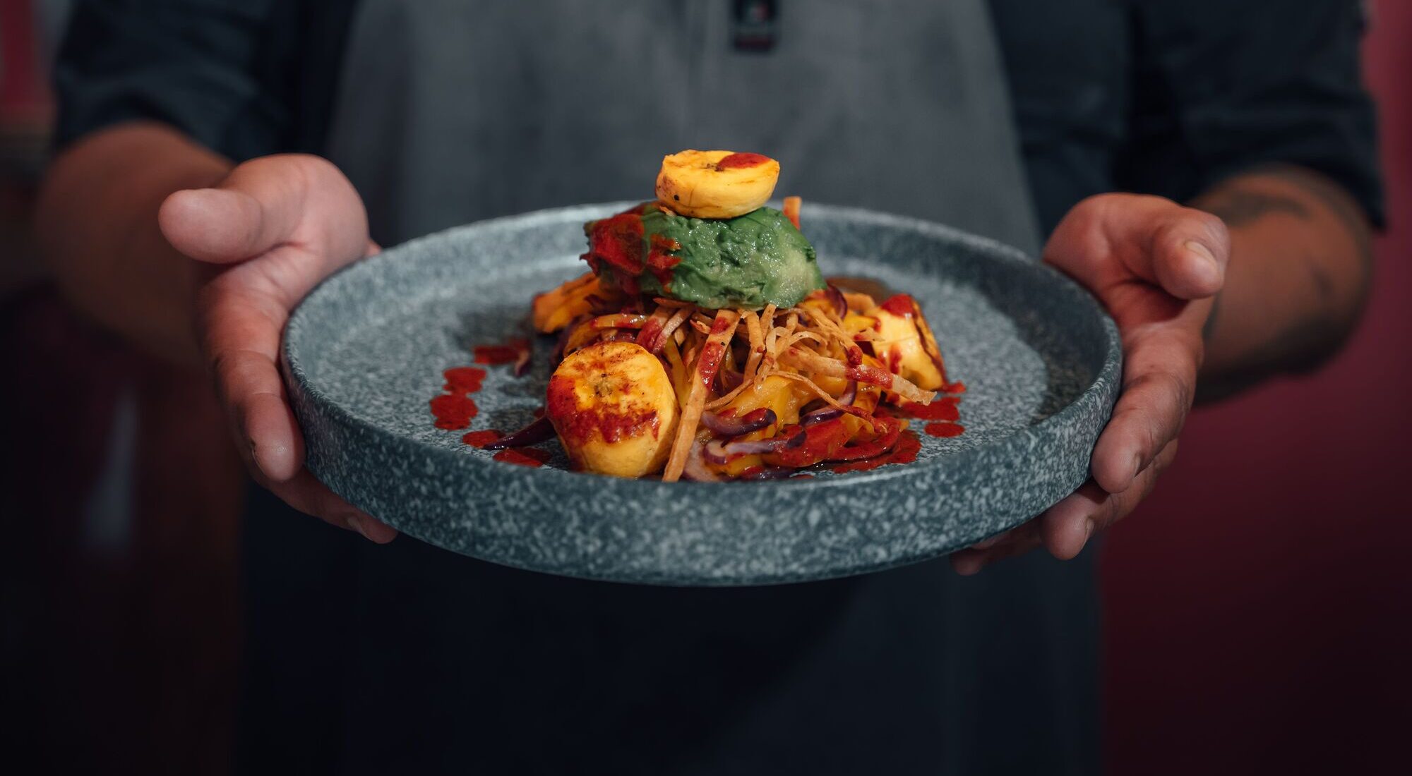
Red, pink, orange, and warm brown hues often arrive with built-in sensory goodwill. The brain has seen those cues before, and it tends to connect them with sweet, ripe, juicy, caramelized, or comforting flavor profiles. That doesn’t mean color can replace formula work. It means color can help the formula land where you intended it to land.
This is especially useful in places where expectation is doing real labor: RTD beverages, gummies, confections, powdered drink mixes, reduced-sugar systems. If the aroma, acid balance, and color are all telling the same story, the product may read sweeter or fuller than a mismatched version of the exact same formula.
Mini-explainer: color can support sweetness perception. It can’t perform a miracle. If the flavor system is thin, sour-leaning, or fighting itself, color won’t swoop in wearing a cape.

Blue has to explain itself
Blue is fascinating because it can absolutely work—and also because it’s less forgiving.
In certain beverages and candy-style systems, consumers have learned the rules. Blue can signal playful, punchy, high-impact flavor. Nobody panics.
But outside those learned contexts, blue has more explaining to do. Naturally blue foods are still relatively rare, especially in everyday savory eating, so vivid blue can read as artificial, cold, medicinal, or vaguely not-food. Research on blue foods and blue environmental cues points in the same general direction: blue can dampen appetite or complicate desirability, depending on context.
That doesn’t mean “never use blue.” It means blue usually needs stronger sensory backup.
Red walks into the room and people think, “Probably sweet.”
Blue walks into the room and people think, “Okay, but why?”

The real issue isn’t novelty. It’s coherence.
Teams sometimes fall in love with a color because it looks exciting in a presentation, on a mood board, or in a clear bottle under perfect lighting. Fair enough. We all enjoy a dramatic entrance.
But novelty and sensory coherence are not the same thing.
A product doesn’t win just because it catches attention. It wins when the color, aroma, sweetness, acid, and texture all point in the same direction. If you’re building a strawberry profile, the appearance has to support the kind of strawberry experience you’re selling. Fresh-picked, candy-bright, creamy, jammy, indulgent—they’re not visually interchangeable. Same goes for citrus, cola-type builds, tropical systems, and every flavor profile that depends on instant recognition.
Consumers will forgive “different.”
They’re much less generous with “confusing.”
Don’t leave color until the end
This is where projects get expensive for avoidable reasons.
If color gets treated like a late-stage cosmetic choice, you can end up with a finished flavor system that’s being undermined by its own appearance. By the time that becomes obvious, timelines are tight, packaging is moving, and nobody’s thrilled to hear that the product still doesn’t look like what it tastes like.
Color belongs upstream. It should be part of the flavor conversation early, not a decorative add-on after the “real work” is done.
That goes double for systems where color can drift over time. Heat, light, oxidation, pH, packaging, and processing can all push color away from its original target. And once that happens, perception tends to drift right along with it. What started as bright and juicy can end up dull, muddy, or just a little less trustworthy by the time it reaches the consumer.
That’s not just a QC nuisance. That’s a sensory problem wearing a QC nametag.
A few rules that save headaches later
First
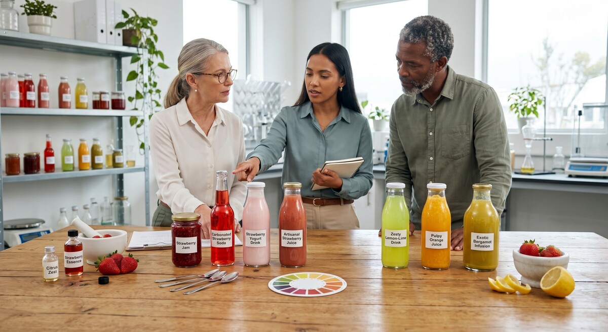
Test color and flavor together early. Not after everyone’s attached. Early.
Second
Use color to reinforce what the flavor system is already doing. If aroma and acid are headed north while color is pointing west, the consumer will feel the mismatch.
Third
Validate under real-world lighting. Retail shelves, home kitchens, office fluorescents, convenience coolers, cup-in-hand in a car at 5 p.m.—products don’t live under ideal lab lights, and neither do consumers.
Fourth
Don’t treat appearance as a separate department. The consumer doesn’t.
They experience one product, all at once. So if color promises “ripe, sweet, juicy” and the flavor says “thin, tart, unclear,” the brain notices the argument.
And the product loses.
Key Takeaways
- Color starts shaping flavor perception before the first sip, bite, or chew.
- Warm, congruent hues can support sweetness and flavor recognition when the rest of the sensory system is aligned.
- Blue can work, but it’s more context-dependent and less forgiving in food applications.
- Color drift over shelf life can change how consumers interpret flavor quality and freshness.
- The smart move is to develop color and flavor together, then validate under realistic conditions.
What to Measure / Check
- Hedonic liking, sweetness intensity, and expected flavor identity across color variants.
- Desire-to-consume or appetite response, especially for unusual hues or reduced-sugar systems.
- Instrumental color values across processing and shelf life, plus surface color distribution where visual uniformity matters.
- Performance under different lighting environments, including retail and at-home use.
Want more insight into the sensory science, formulation strategy, and flavor trends shaping what’s next? Explore the Flavor Industry Insights & Trends hub.
Insights & Trends
Lemon-Lime Lost Its Monopoly
July 14, 2026

Coffee’s Next Frontier
June 22, 2026
Maximalism, Refined: Why Bigger Flavor Is Getting Smarter
June 12, 2026

Spice Without Pain
May 29, 2026
Botanicals Take the Lead
May 14, 2026
Color Talks Before Flavor Does
April 28, 2026

From “Asian-Inspired” to Region-True
April 13, 2026

Strawberry’s Not Moody—Your Formula Is
March 31, 2026

Dessert Déjà Vu, Upgraded
March 12, 2026

Cravings, Rewired: The Science of Shifting Taste
February 26, 2026
Swicy, but Make It Fruit
February 12, 2026

Nostalgia Flavors
January 28, 2026

Stack Attack
January 13, 2026

The Aftertaste Ambush
January 1, 2026

Function in Disguise
December 12, 2025

When Texture Talks Louder Than Taste
November 28, 2025
Spice. Sprinkle. Savor.
November 12, 2025
When Less Is More
October 29, 2025

From Snack to Savor
October 13, 2025

Precision Fermentation
September 29, 2025
View All Blog Posts